Email is 50 years old. It was designed as a way to send text messages between computers. It has become, through sheer inertia and ubiquity, the default channel for creative feedback at most agencies and in-house teams. This is a mistake that teams have been repeating for two decades, and the cost is visible in every creative project that runs longer than it should.
The core problem is a medium mismatch. Design feedback is inherently spatial — "the button in the upper right," "the nav item that turns blue on hover," "the section between the hero and the features grid." Translating spatial references into prose is lossy. Every translation creates ambiguity. Every ambiguity creates a round of clarification. Every clarification round costs time and erodes momentum.
The Seven Ways Email Breaks Design Review
We've catalogued the specific failure patterns that emerge when design feedback runs through email:
- No spatial reference. "The header feels too big" — which header? On which page? At which breakpoint? Email cannot answer these questions because email has no spatial model.
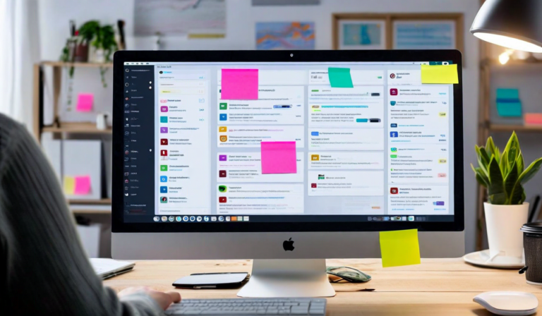
- Thread fragmentation. Multiple stakeholders reply at different times, creating parallel threads with conflicting feedback that nobody reconciles. By the end, the designer has received 11 emails and has no idea which opinion supersedes which.
- Version blindness. The client sends feedback on a design version you updated three days ago. Now you have to figure out which notes still apply to the current version and which are already addressed.
- No resolution state. You address a comment, but there's no way to mark it done. The same issue gets re-raised in the next review because there's no record that it was already handled.
- Attachment chaos. Markups get sent as annotated JPEGs, PDFs with embedded comments, and screenshots with red circles drawn in PowerPoint. Every format is different. None of them integrate with the design file.
- No audit trail. When a decision is contested later, you have to dig through months of email history to reconstruct what was agreed. Email clients are not optimized for this kind of search.
- Late consolidation overhead. Someone — usually the designer — has to read all the emails, extract the actionable feedback, organize it by design section, and prioritize it before starting any actual work. This alone can take 1-2 hours per round.
Why Teams Keep Using It Anyway
If email is so bad for design feedback, why does it persist? Three reasons. First, clients are already in email. Asking them to use a new tool adds friction to the reviewer side of the process. Second, email requires no setup — no account, no login, no learning curve. Third, familiarity feels safe, even when the tool is objectively wrong for the job.
We've seen this change when the alternative is easy enough. When a client can click a link and drop a comment directly on the design without creating an account or learning new software, adoption happens naturally. The barrier isn't resistance to better tooling — it's resistance to complexity. Remove the complexity, and the better tool wins on its merits.
The best feedback channel is one that a client uses spontaneously, on their phone, during their lunch break, without thinking about it. Email doesn't meet that bar anymore. But it was the only option for a long time, so it became the default — and defaults are sticky.
What Good Feedback Infrastructure Looks Like
The alternative to email feedback isn't a more complicated version of email. It's a feedback experience that's built around the design artifact itself. Feedback that lives on the design, tied to specific elements, organized by version, with a clear resolution state that both sides can see.
When feedback is collected this way, the consolidation step disappears. The designer opens the design tool and the feedback is already organized, already spatial, already tied to the version it references. There's nothing to extract, nothing to sort, nothing to reconcile. The review cycle time drops, the revision count drops, and the quality of the feedback improves because reviewers don't have to translate visual observations into prose — they can just point.
Email had a 50-year run as the default for creative feedback. Its time is up. Not because it's bad at being email — it isn't — but because design review is a different problem entirely, and it deserves a tool that was built for it.